Filed under: Art, Color, Design, Inspiration, Typography | Tags: 1970's television, adult swim, big time watching, graphic design, retro, television, youtube
Without a doubt this is one of my favorite commericals of all time. This is a spot on Adult Swim that I’ve been seeing for the last few weeks. I love the simple yet artistic and rendition of 1970’s television. So good it’s almost creepy.
Filed under: Design, Marketing, Photos, Portland, Typography, Writing | Tags: graphic design, pdf portfolio, portfolio
My downloadable 1.3 MB PDF Portfolio.
My 2009 Graphic Design PDF Portfolio
Filed under: Design, Lifestyle, Portland, Typography, Writing | Tags: Design, graphic design, pdf, resume
My 108 KB downloadable PDF résumé.
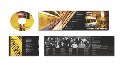
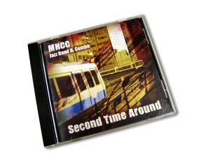
Complete CD packaging proposal including inside booklet, CD tray, and label for the Mt. Hood Jazz Band & Combo 2009 album Second Time Around.
My goal for this project was to create a design that carries out a theme relevant to the band’s trip to The World Games in Kaohsiung, Taiwan. My concept focuses on the urban aspect of downtown Kaohsiung, using images of their train system that runs throughout the city, using warm colors to communicate the tone of the music.
Filed under: Design, Inspiration, Typography | Tags: Canada Type, font, graphic design, Memoriam, Poster Bodoni, type, Typography
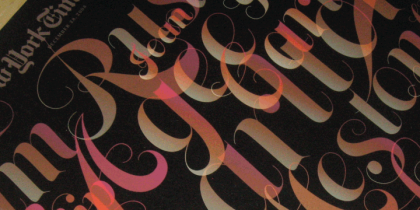
I ran across this amazing font Memoriam on Design That Kills. It instantly gave me the feeling of Poster Bodoni, but with infinitely more flourishes. The font was created by Canada Type as a commission for an all-typographic cover by art director Nancy Harris Rouemy of the New York Times magazine. She won many awards for her typographic design sense. The famous font is available for retail, and at quite a low price. The highest you expect to pay is $20 for your choice of four different divisions of the Memoriam family.
This is truly an amazing font. As I mentioned it is such a large family it was divided into three subgroups for Postscript and True Type. There is also an OpenType version, Memoriam Pro, which combines all three families into one file, an also contains a few extras that aren’t available in the other sets. If you’re using InDesign, Illustrator, and Photoshop above CS, Pro is the one you want. The family also covers an extensive range of Latin-based languages, including Western and Eastern European, Baltic, Turkish, Maltese, and Celtic/Welsh, which gives you over 365 characters in each of the Memoriam fonts. However, be aware that due to the extreme thinness of the hairlines, it is recommended to use Memoriam at large display sizes only.
Filed under: Design, Inspiration, Photos, Typography | Tags: card game, flash cards, font, font family, graphic design, type, Typography
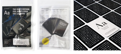
I saw this post called Typographic Card Game on Aisle One and found it interesting. It’s a flash card game with different type families on each card and a typographical glossary. It also has information the evolution of type design, and explains each typeface’s history. I suppose these could be used like like flash cards by designers to help quickly identify fonts and get more familiar with type in general. It’s important for designers to know their fonts, or at least know which ones they used for a project when asked. Although I have to say flash cards for Math never worked for me.
Filed under: Design, Inspiration, Movies, Photos, Typography | Tags: Color, DVD design, Gilmore Girls, graphic design, packaging design, Typography
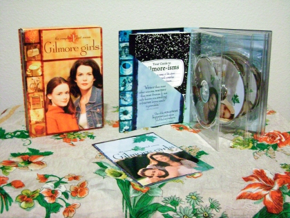
Photo by me
Gilmore Girls is my guilty pleasure. People who know me are surprised that I like this show, given that I’m more into movies, Comedy Central, and Adult Swim. It’s a great show to watch any time, when you’re happy or sad, bored or busy (I actually find that the constant chit-chat going on in the background helps me focus) and it’s great if you’re sick and bedridden because the episodes last forty-five minutes apiece. Given that Lorelai and Rory Gilmore (the main characters) have such a vast appreciation and knowledge of music, movies, and books, biting wit and sarcasm, and not to mention their coffee addiction, it’s no wonder I love this show. I started buying the DVD sets this last fall. I have seasons one, two, and three, but only one and two are pictured here because my neighbor is borrowing the third.
The Gilmore Girls series is one of my favorite packaging designs of all time. I love the font they use for the titles and pull-quotes (Solid Antique Roman), the color schemes for every season, the overall cover layout, and especially the way the set opens like a book, and each DVD has it’s own page so to speak.
I get all of my movies at Half.com these days. You can generally find factory sealed movies for less than half of the store price. Package design copyright 2002 Warner Bros. Entertainment Inc.
Filed under: Design, Typography | Tags: advice, graphic design, Typography, Web Design
I found a great typography reference from the Aisle One blog called 8 Simple Ways to Improve Typography In Your Designs, an article written by Antonio Carusone for Smashing Magazine. He talks about correctly measuring your column width (this is something I found useful when editing my chocolate book), leading, emphasis, and more. He even provides code examples of how you can mark up your text in CSS to achieve better typography on the web. It’s very straightforward and easy to understand – definetly worth a look.
Filed under: Design, Inspiration, Typography | Tags: fonts, free fonts, graphic design, san-serif, serif, type, Typography
This last week and this current week in progress is all about typography for me. I’m refining my business cards, resume, personal logo, and several pages in a book, so naturally I’ve been going through typefaces, critiquing each and every one for my needs and visual direction. I’ve even developed a fondness for fonts that I don’t generally use (such as Helvetica Neue and Avant Garde) and find myself conceptualizing new projects with typography in mind. I’m currently working on a poster for a night student reception, and I’m discovering that type has been my main source of inspiration for design ideas. I suddenly feel the urge to manipulate points, change placement, scale, or angle to communicate my ideas. As someone who is generally focussed on the big picture (“picture” being the key word) especially during the developing stages of my designs, working with type and getting down and dirty with details is a big change of pace, one that I’m really enjoying.
One of my challenges is finding good, versatile, and basic free fonts. It’s easy to find a free grungy font or a calligraphic script, but not so much when it comes to a a beautiful serif or san serif that doesn’t cost an arm and leg. I found these great links from MyInkBlog.com. They include 10 Awesome Free Serif fonts and 10 Awesome Free San Serif fonts. Shop around and enjoy. My current favorite is Tallys of the serif collection. I really am crazy for serif fonts (at their best they are classic, elegant, and organic). However, since I’ve been working so closely with type I’m surprised that I’m choosing to use more san serif fonts instead. I guess its just time to mix it up! I’ve also been discovering that pairing a more geometric, mechanical san serif with an organic illustration creates a wonderful contrast, yet allows the elements to stand on their own without competing. What kind of fonts do you find yourself using over and over? Does it say anything about you as a person or a designer? Which ones have you found a new love for? Why do you suppose that is?
