Filed under: Art, Color, Design, Inspiration, Typography | Tags: 1970's television, adult swim, big time watching, graphic design, retro, television, youtube
Without a doubt this is one of my favorite commericals of all time. This is a spot on Adult Swim that I’ve been seeing for the last few weeks. I love the simple yet artistic and rendition of 1970’s television. So good it’s almost creepy.
Filed under: Design, Marketing, Photos, Portland, Typography, Writing | Tags: graphic design, pdf portfolio, portfolio
My downloadable 1.3 MB PDF Portfolio.
My 2009 Graphic Design PDF Portfolio
Filed under: Design, Lifestyle, Portland, Typography, Writing | Tags: Design, graphic design, pdf, resume
My 108 KB downloadable PDF résumé.
Filed under: Color, Design, Marketing, Photos, Writing | Tags: branding, bright future, children's education, graphic design, identity, letterhead, logo, stationary, sun
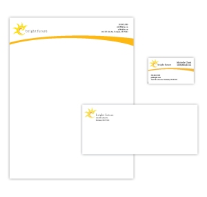
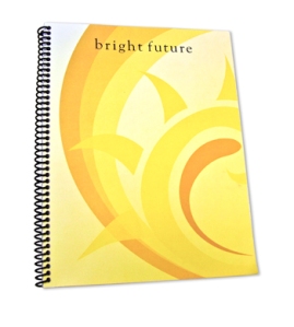
A branding and identity system for a
children’s educational program. Includes
a logo design,correspondence materials, and a notebook as a promotional product.
Bright Future aims to get high school and college level students who are interested in working with children to volunteer in classrooms and teach fundamental education. My goal was to create a professional, yet playful identiy using warm, cheerful colors that appeal to both children and adults.
Filed under: Books, Color, Design, Photos, Writing | Tags: Amy Tan, book, book cover, book cover design, graphic design, The Hundred Secret Senses
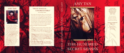
A conceptual cover proposal for the book The Hundred Secret Senses by Amy Tan.
For this design, I emulated a Chinese motif by using a red and yellow color palette along with a background textured with Chinese characters and an elegant serif font. The cover image focusses on one of the main charcters, Kwan who has “yin eyes” meaning she can see ghosts. My approach to this design reflects the tone of the novel; mysterious, slightly sinister,
reflective, historical, and romantic.
Filed under: Color, Design, Marketing, Packaging, Photos, Writing | Tags: cacao, chocolate, cocoa, graphic design, Issuu, logo design, Mexican chocolate, Mexico, packaging design, publication design, The World Cocoa Foundation
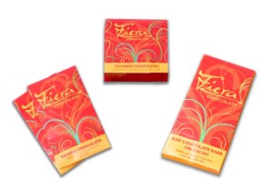
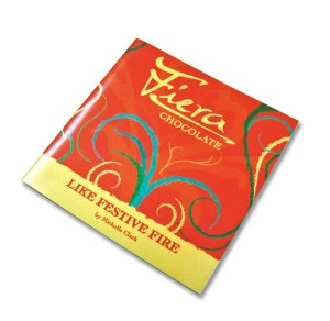
This project is the conceptualization, creation, branding, and promotion of a fictitious cocoa company from Mexico that is also a part of the World Cocoa Foundation and practices ecological and sustainable cacao farming.
The first phase of this project included creating a name, logo, company profile, and designing product packaging for three sample chocolate products.
The second phase involved creating a 26 page booklet with information about Fiera Chocolate, their products, the country of origin (Mexico), the World Cocoa Foundation, and my creative process including logo creation, color palettes, and mood boards.
Filed under: Design, Marketing, Style and Fashion | Tags: boots, shoe catalog, tread, winter boots, women's boots, Zappos
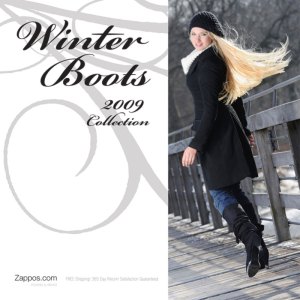
A catalog prototype for Zappos.com featuring a collection of stylish, functional winter boots for women.
The purpose of this catalog is to drive traffic to the Zappos web site by showcasing a special type of shoe and advertising the special services the site offers. This catalog focusses on boots for women who want to stay warm, dry, safe, and stylish during the Winter. I chose a variety of boots from the site, ranging from practical to dressy, that have superior quality and traction.
Filed under: Design, Writing | Tags: Craigslist, craigslister, graphic design, magazine, prototype, publication design, zine
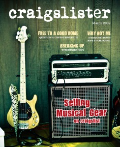
A magazine prototype that captures the spirit of the website Craigslist, using bizarre and funny stories and ads from the “Best Of” section of the site for content.
My vision for this project was to appeal to the eclectic, counterculture aspect of Craigslist. I also wanted to communicate a low-tech, hand made approach. I levereged this through content, photography, type, and color choices.
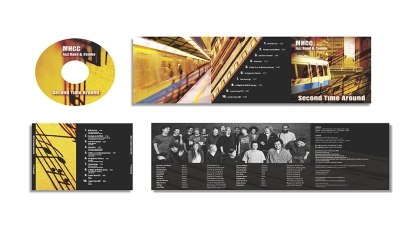
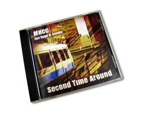
Complete CD packaging proposal including inside booklet, CD tray, and label for the Mt. Hood Jazz Band & Combo 2009 album Second Time Around.
My goal for this project was to create a design that carries out a theme relevant to the band’s trip to The World Games in Kaohsiung, Taiwan. My concept focuses on the urban aspect of downtown Kaohsiung, using images of their train system that runs throughout the city, using warm colors to communicate the tone of the music.
Filed under: Design, Photos, Posters | Tags: graphic design, Guys and Dolls, musical, play, playbill, portfolio, poster
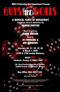
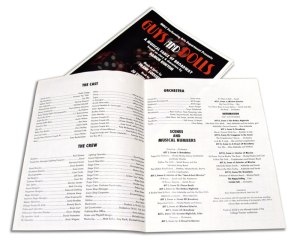
A poster and playbill design for the Mt. Hood Community College’s Winter 2009 production of Guys and Dolls.
As winnter of a poster design contest, I got the opportunity to design the official poster and program for the play Guys and Dolls. Through use of typography, color, and image I designed a poster that has an old-fashioned Broadway look and feel. I continued this idea on the inside of the playbill by using bold, condensed headlines and a traditional type layout.
